WEEK 1


Alphonso Dunn
The first artist who I used for my initial reference is Alphonso Dunn mainly just down to the sheer complexity of his work, his repeated use of different pen techniques and line direction to generate form and give his work structure. It intrigued me because I often struggle with maintaining a level of clarity in my ink work as usually after a few layers the piece just dissolves into a inky mess, however dunn manages to layer his work without it just becoming a mess of lines. He used various cross hatching techniques as well as a consistent use of bold areas of black which he often used to give his pieces depth. Overall I'm using his work mainly as a solid foundation for my own pieces, hopefully I can it to help develop my own cross hatching skills throughout this project. Generally I'm not very well versed with ink and dip pen so I'm curious to see how my skills develop by the end of this brief.
The first artist who I used for my initial reference is Alphonso Dunn mainly just down to the sheer complexity of his work, his repeated use of different pen techniques and line direction to generate form and give his work structure. It intrigued me because I often struggle with maintaining a level of clarity in my ink work as usually after a few layers the piece just dissolves into a inky mess, however dunn manages to layer his work without it just becoming a mess of lines. He used various cross hatching techniques as well as a consistent use of bold areas of black which he often used to give his pieces depth. Overall I'm using his work mainly as a solid foundation for my own pieces, hopefully I can it to help develop my own cross hatching skills throughout this project. Generally I'm not very well versed with ink and dip pen so I'm curious to see how my skills develop by the end of this brief.

Some initial still life pieces done in fine liner, previously in my work I haven't paid much attention to the specific cross hatching techniques I used however this time I tried to keep the line direction consistent and aimed to avoid any scribbling or inconsistent lines.


Then I attempted to do some more detailed architectural pieces whilst maintaining the same level of discipline as I did during the first few still life pieces, I found it was interesting to do something more detailed as the cross hatching helped to an extent. Firstly by keeping the line direction consistent it did help with generating tone and conveying shadows as the direction automatically suggested that the shadows were on a consistent plain. However due to keeping a higher level of consistency it makes it all the more apparent when any errors occur as they simply stand out a lot more. Overall I'm pleased with how these pieces turned out given that prior to this project I had very little experience with both cross hatching and architectural studies.

As I became more confident with the process I started to slowly incorporate some of my own stylistic elements into my pieces, by this I mean I was less rigid with trying to go for total realism, by all means still using still life as my basis but more as a rough guide than a step by step rule book. Personally I like this particular piece which depicts the view from the top of my street mainly because the elevation results in an interesting focal point being the buildings roofline.


Moving on I began focusing still life and did some initial drawings of various objects around the house, now to begin with I wasn't confident again since realism as a whole isnt something I often aim for in my own work. However after some basic practise on some smaller pieces the process as a whole did become a lot easier for me and I feel that my work reflects this progression. I also started to incorporate solid black into my work more in an attempt to add more contrast to the pieces, in some instances this worked better than in others but overall I feel that this is another confidence thing and that with practise I'll improve.
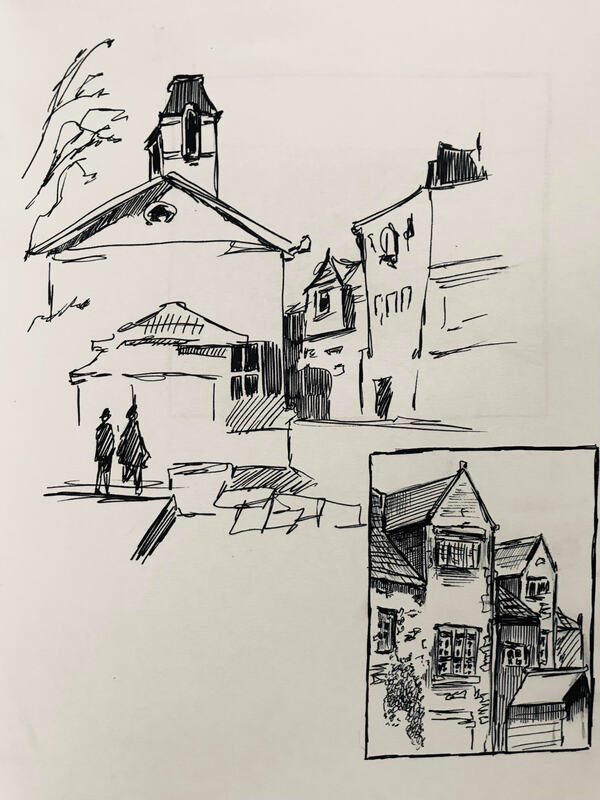


A double page spread depicting the view from my living room window, I tried to exaggerate the contrast of the shadows in the curtains using solid black but I think the piece as a whole just needs more tone added to it to help convey this idea more effectively.
Week 2
Experimental Image Making
Experimental Image Making
Towards the start of this particular brief I had little to no experience in working with 3d imagery mainly because my main focus of work is illustration so it's not something I've had to tackle previously so I wasn't very confident with how this task was going to turn out.

|

|
Picasso
Initially I looked at Picasso based on recommendation as his abstract work seemed like a good starting point, now although these particular examples were achieved using metal I think that I should be able to achieve something similar using more basic materials. I'm more drawn towards his bull head piece on the left as it's less blatant and slightly more abstract and experimental than the goat on the right.
Initially I looked at Picasso based on recommendation as his abstract work seemed like a good starting point, now although these particular examples were achieved using metal I think that I should be able to achieve something similar using more basic materials. I'm more drawn towards his bull head piece on the left as it's less blatant and slightly more abstract and experimental than the goat on the right.

|

|

|
Alan Fletcher
Moving on from Picasso I looked at some pieces done by Alan fletcher, his work differs from Picasso's mainly I think due to the child-like nature of it. This pure simplicity of it to me adds to the imagery as its less perfect and refined, this best example of this to me is his ashtray piece which just consists of two ashtrays on top of each other yet it still effectively translates as a unique looking. I'll mainly use his pieces that were made out of rubbish as a basis for my own work but I don't think Ill paint mine in such a simplistic way, personally I prefer the natural look of all the materials meshed together.
Moving on from Picasso I looked at some pieces done by Alan fletcher, his work differs from Picasso's mainly I think due to the child-like nature of it. This pure simplicity of it to me adds to the imagery as its less perfect and refined, this best example of this to me is his ashtray piece which just consists of two ashtrays on top of each other yet it still effectively translates as a unique looking. I'll mainly use his pieces that were made out of rubbish as a basis for my own work but I don't think Ill paint mine in such a simplistic way, personally I prefer the natural look of all the materials meshed together.

For my first piece I aimed for it to be overly simplistic the intention being how little does it take to convey a particular concept, I started off with just a strip of cardboard which I curved and manipulated until eventually I viewed it as a sort of slender spine of sorts. Running with this idea I used certain dog species such as greyhounds or whippets as a reference and continued to play around with the overall shape, eventually I settled on this parabolic curve design where it lifts up at the end. Then I used safety pins as legs and again used reference of actual dogs to determine the general placement of them, I noticed how just small changes to the individual positions would greatly alter the look of the piece and how certain placements looked far more realistic in a way. Overall despite the fact that this piece only consists of pins and a single piece of cardboard I think it was my most successful attempt at this brief.

Moving on from my first attempt I tried to create something that was less abstract than what I had attempted before, not a realistic sculpture but something that had a more realistic shape at least, I still wanted it to look like a bunch of recycled junk at the end but junk in the shape of a dog essentially. I used a cardboard tube as the main body and layered paper on top to give it some mass, on top of this I added rolled up sheets of paper to give the impression of strands of matted or thick hair similar to a sheep dog, developing this idea further I decided to continue layering paper on top of the body in an exaggerated manor to hide the more rougher looking areas, at the time this seemed like a good idea but in retrospect it just turned the piece into a crumpled looking mess really, it still has a vague animalistic resemblance but nothing like what it could've been if I just spent a little more time refining it rather than just jumping straight in. So despite the fact that this particular piece didn't go to plan I still feel like it was a necessary failure, in a sense it taught me to pick and choose when to add material.


With what I had learned from my first two attempts in mind I moved on to a more developed final sculpture, I was going to again lean more into the concepts of my second sculpture and would try to create something more objective however I would again try to exaggerate certain aspects of it to sort of play into particular stereotype's. I decided I would try and create a bulky bull dog esc sculpture similar to something from 'Tom & Jerry', something very over the top but still vaguely based on a particular breed. Starting off I used a coke bottle as a base and again began just layering paper balls on top to give it mass, however this time I looked at reference for bull dog muscles so that, unlike last time, the mass wouldn't just be overall and it would be more specific and targeted. I made the front legs and general upper body far more bulky and exaggerated than it should've been similar in a way to a body builder, from looking at some cartoon examples the bulldog is often depicted as a sort of thug so I aimed to lean into this idea for my sculpture. I followed a similar process for the head and face just adding paper in specific areas to suggest a general shape, after this I covered the whole thing in a thin sheet of paper to act as a skin of sorts, additionally I watered this paper down to make sure it would sink into all the cracks and crevasses of the muscles to maintain the overall shape. As mentioned at the start I didn't want to paint these sculptures as to me being able to see that they're all made from junk adds to the overall effect of them, so after the paper skin was dried I just left the model how it was, in retrospect it probably would've been a better idea to add some more specific features to it, such as eyes or toes to the feet, but overall I still think the sculpture is effective.
Week 3
Paint - (Making An Impression)
Paint - (Making An Impression)
Prior to this brief I had some experience with paints, mainly acrylics, but I was curious to finally be able to experiment with watercolour in this task, Generally I was looking forward to being able to play around with the medium as a whole.
Van Gogh
To start off with I looked at artists such as Van gogh to see how what elements I could draw from there work, going into this brief I knew that I didn't want to just aim for plain realism since that's not something I enjoy doing and subsequently I feel the end produce would be more reflective of my general skill level if its something that I was more passionate about. The main element from Van Gogh's work I like is how he incorporated texture into his work by using specific paint strokes onto the surfaces of his subjects to help break up the overall piece. Additionally I like how even thought he does stick to a certain colour pallet in some areas he differs from it and adds in some exaggerated highlights into the piece, this is more noticeable in the piece on the right.
To start off with I looked at artists such as Van gogh to see how what elements I could draw from there work, going into this brief I knew that I didn't want to just aim for plain realism since that's not something I enjoy doing and subsequently I feel the end produce would be more reflective of my general skill level if its something that I was more passionate about. The main element from Van Gogh's work I like is how he incorporated texture into his work by using specific paint strokes onto the surfaces of his subjects to help break up the overall piece. Additionally I like how even thought he does stick to a certain colour pallet in some areas he differs from it and adds in some exaggerated highlights into the piece, this is more noticeable in the piece on the right.

|

|
Monet
Another artist I used for my initial research is Monet, some aspects of his work that I like is how he balances the level of detail in his pieces. Something I struggle with is giving my paintings a sense of depth whereas in Monet's work he can place objects at various depths in the frame and still maintain an excellent sense of realism. For example in this piece the lemon in the front is very detailed the same goes for the head of the fish, whereas the pan and the muscles are more vague and suggestive in there level of detail which helps push them into the background of the piece. However compared to Van Gogh his colour pallets are often more muted and bland which I'm not a big fan of since it just dulls his work in my opinion.
Another artist I used for my initial research is Monet, some aspects of his work that I like is how he balances the level of detail in his pieces. Something I struggle with is giving my paintings a sense of depth whereas in Monet's work he can place objects at various depths in the frame and still maintain an excellent sense of realism. For example in this piece the lemon in the front is very detailed the same goes for the head of the fish, whereas the pan and the muscles are more vague and suggestive in there level of detail which helps push them into the background of the piece. However compared to Van Gogh his colour pallets are often more muted and bland which I'm not a big fan of since it just dulls his work in my opinion.


Moving on I experimented with using acrylic and did some initial pieces, the first being just a door handle from my house. Leaning into what I mentioned with Van Gogh's work I used some exaggerated tones for the highlights and the shadows to help give the piece some more tonal range, additionally I was less rigid with the overall composition of it meaning I didn't really aim for perfection/ total realism with it, with this in mind it allowed me to be more fluid with the piece so the perspective is slightly off and the lines are never straight but because this is consistent throughout the entire piece it doesn't distract the viewer too much I feel.
For my second attempt I just did a quick painting of my hand in a clutched position, again I didn't really aim for perfect realism with it but wanted something that was more tonally accurate than my first piece. Something which I now I sometimes struggle with when painting skin is it just becoming too dull and smooth to the extent that it has a plastic like look to it, with this in mind I tried to keep the brush strokes more rough to help break up the surface a little, expanding on this I left large areas as just white to again help break up the surface and give the piece more shape in a way.
For my second attempt I just did a quick painting of my hand in a clutched position, again I didn't really aim for perfect realism with it but wanted something that was more tonally accurate than my first piece. Something which I now I sometimes struggle with when painting skin is it just becoming too dull and smooth to the extent that it has a plastic like look to it, with this in mind I tried to keep the brush strokes more rough to help break up the surface a little, expanding on this I left large areas as just white to again help break up the surface and give the piece more shape in a way.

Moving on from working in acrylic I began experimenting with watercolour, again this was something that I hadn't really been able to do before so I was curious to see how the medium behaved. At first I attempted to work out in the field and tried to depict a scene from my bus journey, however I found out how easily watercolour layers bleed and soon gave up on my first piece. On my second attempt at it I left more time in between layers to make sure they were fully dry, I also used lighter tones and simply layered than up rather than working darker and using water to lighten them. This helped me to slowly build up tone in the piece. Similarly to my acrylic studies I wasn't really aiming for complete realism with this piece, mainly I just wanted something that vaguely resembled a scene and wasn't just a muddy mess of colour.

For my second watercolour study I tried to depict a scene from my living room, this time being a housemate sat across from me. Similarly to my first attempt I again was purposefully vague with the application of tone and instead tried to use it more so to just suggest shape. I tried to keep what I had learned from my first piece in mind with this one but in some areas I was too impatient which again led to some areas bleeding through to others, however as this only occurred in small areas I didn't consider it too much of a problem this time around. Overall I feel that there is some progression between these two pieces, mainly in my confidence level going into them. Additionally I was more comfortable with the medium as a whole for my second piece so I could apply it more effectively, by this I mean I was aware of the thickness of the brush strokes so I could be more controlled when applying it to the page. Generally I feel that my confidence and overall skill with this medium will grow the more I experiment with it.

|

|
Moving on I continued to experiment and flip between acrylic and watercolour, I didn't really develop any particular preference for either as I was still just messing around with the medium at this stage. I tried doing some quick portraits and was less critical with the particular accuracy of them, essentially I didn't really try and hide any errors that occurred and instead just tried to either incorporate them into the piece or work around them. As evidenced by the one on the right sometimes this approach didn't really work out in the end, sometimes I was a bit limited in my ability so some mistakes were a bit too significant to work around but I still kept them so I could reflect back when necessary. Portraits and life drawing as a whole isnt something I really do too often so I was thankful that I was given the opportunity to expand my abilities with this task.
With regards to my life drawing attempts, some of them were slightly more successful than others. Below is my attempt at painting a tomato, the left was my first go at it and it just became a mess of red essentially. I didn't leave enough time for the layers to dry so after a while they just bled into each other and the scale of tone was lost. So I tried again but scaled it back a bit. Rather than painting a small section I just framed in so the entire tomato was in shot which made it a lot easier for me since I was less focused on the individual imperfections and instead just concentrated on mapping out the rough areas of tone.
With regards to my life drawing attempts, some of them were slightly more successful than others. Below is my attempt at painting a tomato, the left was my first go at it and it just became a mess of red essentially. I didn't leave enough time for the layers to dry so after a while they just bled into each other and the scale of tone was lost. So I tried again but scaled it back a bit. Rather than painting a small section I just framed in so the entire tomato was in shot which made it a lot easier for me since I was less focused on the individual imperfections and instead just concentrated on mapping out the rough areas of tone.

I also tried to do some more experimental esc portrait pieces where I would mess around with the light source before hand to see how it would impact the general contrast of the final image. This is an example of one of these style of pieces, I used a warm light to enhance the warmer tones on the skin so that when I painted it there would be a sort of general warm wash over the whole piece, however along with this I also took some creative liberties with the tones I used just to make it more personal to my own style. For example adding purple tones in the shadows. So although it isn't entirely accurate to life when compared to a traditional life drawing I personally prefer this piece over any of my others from this particular task purely because its the first one that has my essence I think.

Another set of still life's I did in water colour, one being a whisky bottle and the other my view from the living room whilst staring at the tv. For these two since I did them around dusk I had to use the living room light which has a yellow/bronze hue to it whilst I painting them, as a result this hue was carried over to the finished paintings. To apply this hue to them I initially thought I could just apply a wash after the fact but as I worked through them I just started mixing browns and yellows into the tones as I applied them, essentially purposefully muddying the various tones but in a consistent way. The end result I feel does have a unique look to it, the bottle in particular to me both has that distinctive feel of a life drawing whilst still maintaining a feel of something more personal, effectively a balance between my previously mentioned portrait piece and and existing example of still life.

|

|
Photoshop

|

|
After hearing the name of my given band, 'Super Dated', the first thing that came to mind was something in the style of a 90's grunge poster. Just the name to me sounded like a punk underground style of band so I started by looking at existing posters from this era to see if there were any existing patterns and trends that they all exhibit. The first thing I picked up on was that typically they all used similar style imagery, either consisting of a photo of the band members themselves in a urban esc setting or it would be a compilation of various images in a pop art esc manner. In some instances the images used would be recognisable figures. Additionally they all had a fairly consistent colour pallet being vibrant and pastel so lots of warm colours paired together. With regards to the typography they featured it would usually be bold with certain graphic textures overlaid on top to give it that grunge feel I. Taking all of this into consideration I had a vague idea of where I wanted to start with the thumbnails but tried to keep an open mind still as to not get too fixated on a certain style or look at this early stage.

|

|

To start with I sketched up some initial thumbnails, with the basis for my poster design being 90's grunge I used several examples as reference and noticed how the majority of them followed a similar format. Typically they would combine either an image of the band themselves or they would mash together various images that bared nothing in common with the actual band itself. Additionally the colour pallet would typically be quite vibrant with panels overlaying each other and text would often cross the boundaries between them, personally I feel this gives the posters a unique sense of flow to them. So using all these factors as a basis I created a set of initial thumbnails ranging from more objective imagery, such as individual faces, as well as some more abstract pieces. Additionally I stuck to the vibrant colour pallet idea mainly used pastels or warm tones.

|

|
After my initial sketches I selected several that I felt were most effective and refined them, mainly by drawing them more accurately to how they would look like if they were final designs. Additionally I paid more attention to the location of the text as well as the particular typography and font style, generally the fonts used were more abstract and hand drawn which is something I feel works well with my particular style of work. Also I tried to section off areas where I could place additional text if necessary, such as details about the concert.
Finally before moving on to working digitally I sketched up one final refined version of my poster design, deciding in the end to go with a design that features a sketch of a torso. This final version helped me to get a better sense of where I would place details such as the title name as well as more subtle features like the boarders.
Finally before moving on to working digitally I sketched up one final refined version of my poster design, deciding in the end to go with a design that features a sketch of a torso. This final version helped me to get a better sense of where I would place details such as the title name as well as more subtle features like the boarders.


This is the final design I produced in the end and overall I like how it turned out, considering I mainly work almost exclusively traditionally and have very little experience working digitally. In terms of the actual art work it was done by scanning in one of my illustrations so it wasn't too hard to convert over, additionally blocking in the main areas of colour wasn't too challenging either as it just involved manipulating blocks of colour. I tried to match the colours as best I could to my semi finished sketch but in the end did end up altering the levels slightly just to make it more visually appealing. However an area where I think I could've invested more time in is most likely the typography elements, im not very well versed in the existing font styles so just selected them based off of which ones seemed to mesh well together on the poster. If I were to re do this task I would try and research different fonts more in depth just so I had more options to work with. Although something which I'm very happy with is how I used different texture overlays to give the impression that the poster was wrinkled and stained, to me a poster from this era would be pretty ruined at this point if it had survived since the 90's so I added some stain textures in places as well as several paper textures to break up the uniformity of it. In addition to this I looked into how light breaks down the ink that would've been used and subsequently altered the page texture in a way to try and mimic the natural degradation that would occur if a poster like this had been left out in the open for a period of time.
Overall considering this was my first major attempt at messing around with photoshop in this nature Im pleased with the outcome, of course I would've preferred to have done something like this entirely digital but being forced out of my comfort zone I feel as helped progress my overall artistic ability I feel.
Overall considering this was my first major attempt at messing around with photoshop in this nature Im pleased with the outcome, of course I would've preferred to have done something like this entirely digital but being forced out of my comfort zone I feel as helped progress my overall artistic ability I feel.
Illustrator

|

|
Week 9
Action !
AMBUSHED
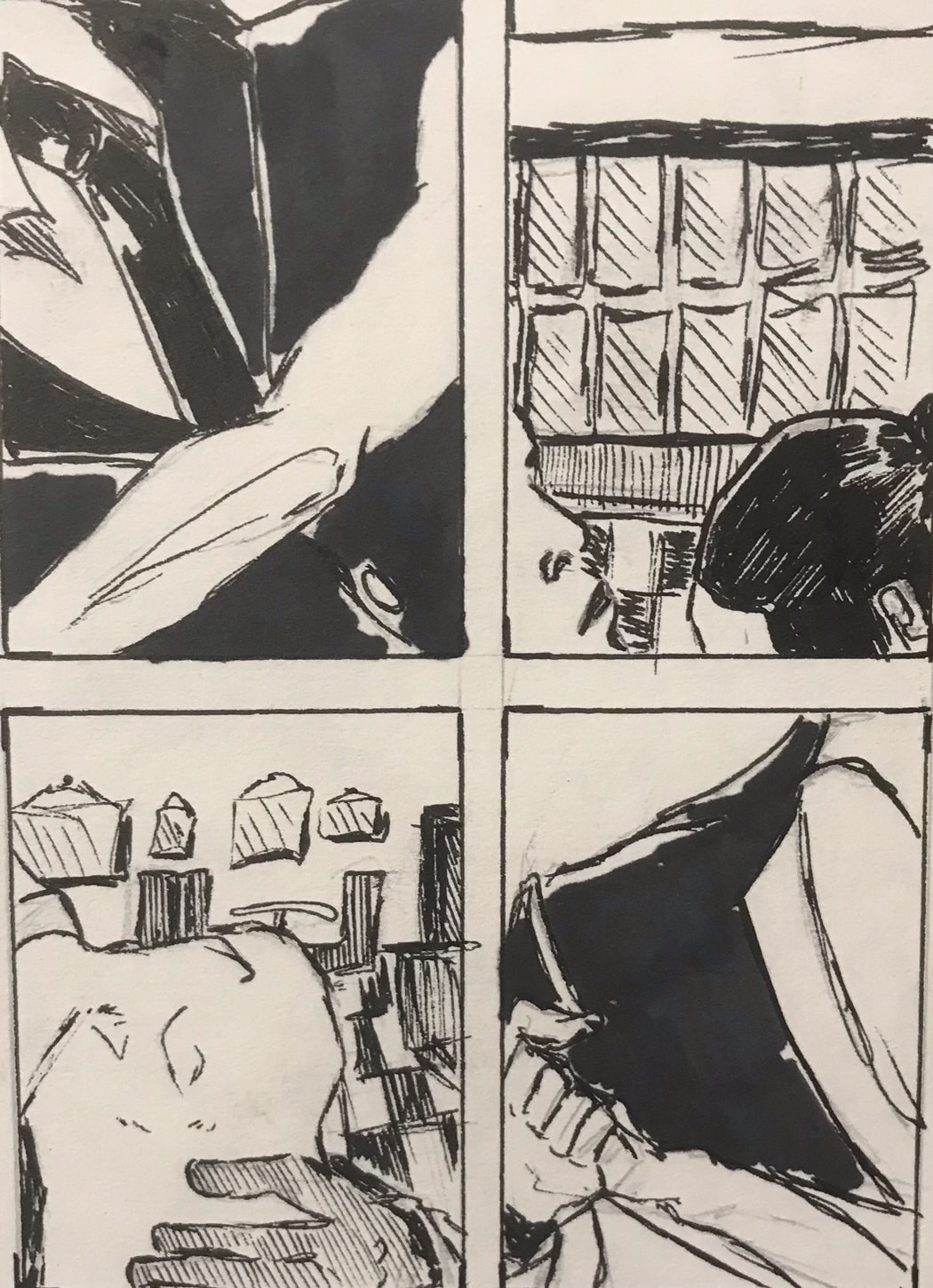
For the first design the prompt was ambushed so I sketched up some initial thumbnails keeping in mind the key ideas that had to be featured, mainly how there had to be two figures and it had to be occurring in the city backstreets. Since this was just the first stage I wasn't too concerned with the specific details and was generally quite vague with each design, I didn't use colour at this point so for areas where I needed to separate layers I just used differing lines and bold areas of black. I experimented with different concepts ranging from simple muggings at gun point to someone being grabbed or having a hand lurking nearby another figure. Also I played around with the specific view point of the scene, for example some designs were done in a POV style whereas others are almost completely removed from the actual focus of the scene. Generally I just wanted to get some basic ideas on paper.
Action !
AMBUSHED
For the first design the prompt was ambushed so I sketched up some initial thumbnails keeping in mind the key ideas that had to be featured, mainly how there had to be two figures and it had to be occurring in the city backstreets. Since this was just the first stage I wasn't too concerned with the specific details and was generally quite vague with each design, I didn't use colour at this point so for areas where I needed to separate layers I just used differing lines and bold areas of black. I experimented with different concepts ranging from simple muggings at gun point to someone being grabbed or having a hand lurking nearby another figure. Also I played around with the specific view point of the scene, for example some designs were done in a POV style whereas others are almost completely removed from the actual focus of the scene. Generally I just wanted to get some basic ideas on paper.


|

|
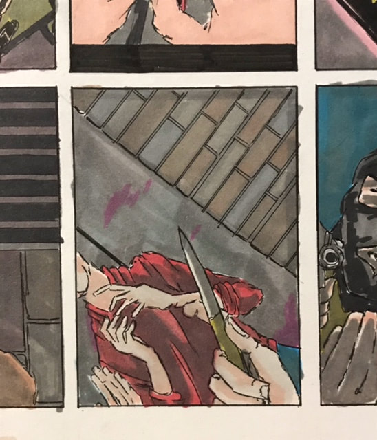
These two designs stood out to me the most at this stage, the one on the left mainly due to how the second figure is arched almost all the way around the edge of the frame with the first figure being placed in the centre. The second, even though its far more simple in concept, due to how its more suggestive and less objective if that makes sense. The POV view point and hands show the first figure whereas the knife blade being help up the the persons face suggests there's two figures in the frame. Overall I'll continue to develop these ideas to see how the evolve.

Moving on I refined my initial designs by adding colour to them and in general paying more attention to the specific details in each scene, since all of the designs are set at night they all have this general dark wash over them to help mute the tones. I tried to incorporate the background into the shots more rather than just have it as a general backdrop so each scene is fairly unique in that aspect, additionally I tried to keep the perspective of each design in mind even though I did take some creative liberties to help make some of them a little more dynamic.
|

|
SYSTEMS FAILURE
Moving onto the second prompt being 'systems failure', I followed a similar work process as to the first prompt, starting off with just some initial designs and slowly developing them into a more refined final image. For this prompt I experimented with various space imagery ranging from a pilot wrestling his ship under control to a ship being ripped apart by a blackhole, again I tried to exaggerate certain aspects of each design to help make them slightly more dynamic.
Moving onto the second prompt being 'systems failure', I followed a similar work process as to the first prompt, starting off with just some initial designs and slowly developing them into a more refined final image. For this prompt I experimented with various space imagery ranging from a pilot wrestling his ship under control to a ship being ripped apart by a blackhole, again I tried to exaggerate certain aspects of each design to help make them slightly more dynamic.

This design shows the process of adding colour to the first drafts, this particular example I felt didn't need that much altering so I left it pretty much un changed I just refined the line work slightly and corrected some aspects of the background. When it came to adding colour I kept it fairly basic and just added some blood under his nose to subtly convey the idea that there's a physical struggle going on, although his expression slightly gives it away.

|

|

|

|
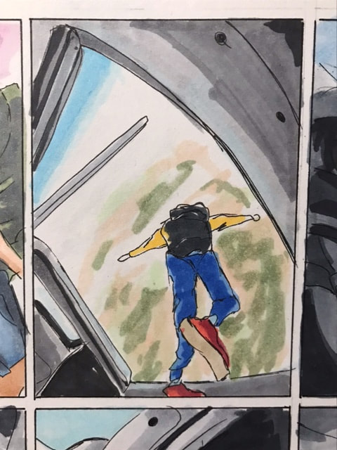
This was the second stage of the refinement process, just adding colour to the designs and making changes where it was necessary. Both designs are based around the same concept, a character being sucked out of his ship into space, however I tried to play around with the perspective a little. The one on the right has almost all of the detail hidden by his hand which although its fairly basic I do think its quite unique and dynamic. On the other hand the one on the right has the character illustrated in a distorted manner so he's curved towards a point in his ship giving him that arched stance.

This was the final page of potential ideas I was left with after I had added colour and experimented more with them, some designs are very similar to their original concept where as others are virtually un recognisable to what they stemmed from. Due to the setting being space I was originally drawn towards a more vibrant sci fy style colour pallet however with it being systems failure it made more sense to me to have it more washed out and muted as if the ship was broken and running on emergency power perhaps.
VERTIGO
The next prompt was vertigo and I had to include a steeplejack, not knowing what this was initially I did some research and sketched up some basic ideas of one of them sitting on top of a city's skyline, I looked at images of the empire state building being constructed and how the men would be balanced on girders high about the buildings. An alternative approach I took to try and convey the sense of vertigo was by having the frame be from the bottom looking upwards at the building as if from the perspective of a passer by, both are fairly polarizing concepts but both I feel still convey the necessary information across to the viewer.

Unlike with my other prompts after I added colour to these initial sketches and refined them more only a few stood out to me so it was easier to narrow them down, I also found that I could keep the main figure just in silhouette and just alter the light source which both helps stop the shot from getting too complex and gives it an interesting look I feel.

Tango
This prompt was tango and it was the one that I was most intrigued about, mainly due to the particular elements which had to be included within it. It needing to be close up and erotic initially made me want to just depict various close up shots of a couple dancing however having to set it within a café forced me to broaden my outlook a little more. I played around with having the couple not actually be dancing but having them be within a photograph in an American style diner, the diner setting was mainly down to the checkerboard flooring being very recognisable to viewers.
This prompt was tango and it was the one that I was most intrigued about, mainly due to the particular elements which had to be included within it. It needing to be close up and erotic initially made me want to just depict various close up shots of a couple dancing however having to set it within a café forced me to broaden my outlook a little more. I played around with having the couple not actually be dancing but having them be within a photograph in an American style diner, the diner setting was mainly down to the checkerboard flooring being very recognisable to viewers.
|

|
When it came to developing the ideas I followed a similar process as to the previous designs, however with this prompt I was finally able to mess around with some more vibrant colour pallets that didn't need to be muted or washed out, in particular I thought that I could make the tango dancers themselves stand out. Although I was initially more drawn towards one of the more obscure design's where its focused on the footwork of the dancers I instead found myself favouring the design which is zoomed in on their faces, it meets the requirement of close up and erotic and the elements of café and tango are instead more subtle.

A Giant Leap

|

|


AMBUSHED
|

VERTIGO
|

TANGO
|

SYSTEMS FAILURE
|

A GIANT LEAP
|
Body Language
Angry Bosses
Due to the similar nature of this task and the previous one I followed a virtually identical creative process, starting off with some initial sketches and played around with rough concepts, I decided I wanted to create a parody style poster so rather than it being two bosses having a subtle argument instead they're basically murdering each other.
Due to the similar nature of this task and the previous one I followed a virtually identical creative process, starting off with some initial sketches and played around with rough concepts, I decided I wanted to create a parody style poster so rather than it being two bosses having a subtle argument instead they're basically murdering each other.


Good News


The Big Jump
|

|

|

ANNIVERSARY
|

GENIUS AT WORK
|
|
THE BIG JUMP

ANGRY BOSS
|

GOOD NEWS
|
Communicative Colour
corn/wheat
beaty trees
ypung men
streets/temple
corn/wheat
beaty trees
ypung men
streets/temple