Week 1
Artists Sketchbooks


@Penkeeper - (Instagram)
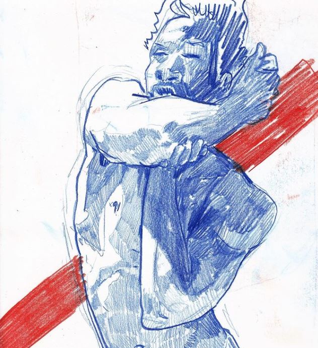
Drawn to this artist mainly due to how similar our styles are, we both seem to focus on similar subjects, being a variety of figures and just general anatomy, additionally I just like his use of composition and how even with the more simpler pieces he breaks up the empty space with areas of colour or changes in tone. I'm also intrigued by his use of line variation which he uses to both depict a difference in surface texture and just general tonal variations caused by shadow, generally his work is all fairly consistent in appearance by this I mean it all looks as if it was done by the same person which, although it seems simple, is something I sometimes struggle with. In terms of materials they typically work traditionally beginning with a pencil sketch which then, depending on the piece, they either go over with in fine liner and then use marker to add tone or they scan it and add colour digitally. I'll most likely stick to traditional mediums when I adapt his work to my own projects just down to me being more comfortable with that sort of work over something like digital. Overall I'm using this artist as an initial reference due to how our works are similar so hopefully he should provide me with a good starting off point. There work just has this feel to it I'm not really sure how to describe it, I kind of view it as a natural progression of my own work again since they're so similar as it is.
Drawn to this artist mainly due to how similar our styles are, we both seem to focus on similar subjects, being a variety of figures and just general anatomy, additionally I just like his use of composition and how even with the more simpler pieces he breaks up the empty space with areas of colour or changes in tone. I'm also intrigued by his use of line variation which he uses to both depict a difference in surface texture and just general tonal variations caused by shadow, generally his work is all fairly consistent in appearance by this I mean it all looks as if it was done by the same person which, although it seems simple, is something I sometimes struggle with. In terms of materials they typically work traditionally beginning with a pencil sketch which then, depending on the piece, they either go over with in fine liner and then use marker to add tone or they scan it and add colour digitally. I'll most likely stick to traditional mediums when I adapt his work to my own projects just down to me being more comfortable with that sort of work over something like digital. Overall I'm using this artist as an initial reference due to how our works are similar so hopefully he should provide me with a good starting off point. There work just has this feel to it I'm not really sure how to describe it, I kind of view it as a natural progression of my own work again since they're so similar as it is.


@Magsmunroe - (Instagram)
This is another artist I found from Instagram but she has a very different art style to that of the last one, hers is objectively more abstract with the line width varying more drastically and incorporating a much boarder use of solid black shadow into her work. She typically used bolder lines to add indications of things rather than depicting each individual detail, additionally her use of linework is far more simplistic with empty space being far more frequently incorporated into the overall pieces be it for depicting skin or just a plain space in the image. She typically depicts a variety of subjects often being figures as well as a selection of life drawings from her general environment. With regards to her use of mediums she again switches between digital and traditional, either lining her work with marker and fine liner and adding colour using paint or alcohol markers.
This is another artist I found from Instagram but she has a very different art style to that of the last one, hers is objectively more abstract with the line width varying more drastically and incorporating a much boarder use of solid black shadow into her work. She typically used bolder lines to add indications of things rather than depicting each individual detail, additionally her use of linework is far more simplistic with empty space being far more frequently incorporated into the overall pieces be it for depicting skin or just a plain space in the image. She typically depicts a variety of subjects often being figures as well as a selection of life drawings from her general environment. With regards to her use of mediums she again switches between digital and traditional, either lining her work with marker and fine liner and adding colour using paint or alcohol markers.


Jamie Dodds
Personally I admire the fluidity of their work and how it doesn't fully conform to the rules and bounds of realism, the lines are more so suggestions rather than objective guides and its the use of tone that gives them shape. Additionally this concept is aided by her use of charcoal as her preferred medium which lacks a sharp edge giving her pieces this smooth feel to them.
Week 2
Alphonso Dunn
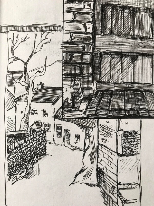
Initially before starting the urban sketching task I wanted to try and learn the basics essentially, prior to this project I have no experience really with the idea of converting buildings from my eye to the page so I was curious as to how other people who are more comfortable with the process tackle it really. I was aware off Alphonso's work prior to this task but I was unaware that he had experience with urban sketching, additionally his methods were also very intriguing for me. I learned from his work the idea of just blocking in tone generally rather than working in specific areas, along with this was the technique of using line direction to signify texture which helped make his pieces look nice and well structured rather than just a mess of scribbled pen strokes.
Initially before starting the urban sketching task I wanted to try and learn the basics essentially, prior to this project I have no experience really with the idea of converting buildings from my eye to the page so I was curious as to how other people who are more comfortable with the process tackle it really. I was aware off Alphonso's work prior to this task but I was unaware that he had experience with urban sketching, additionally his methods were also very intriguing for me. I learned from his work the idea of just blocking in tone generally rather than working in specific areas, along with this was the technique of using line direction to signify texture which helped make his pieces look nice and well structured rather than just a mess of scribbled pen strokes.

Mark Crilley
Another artist who I used for my initial research was Mark Crilley, now despite being primarily a manga and comic artists I mainly used his work as practise for working with and breaking down various perspectives. I found at first my pieces were always off when it came to the perspective which discouraged me from continuing them, so learning the simple methods he used to construct his scenes was helpful for me and once I was able to observe how he worked the idea of constructing a large urban scene became far less daunting for me.
Another artist who I used for my initial research was Mark Crilley, now despite being primarily a manga and comic artists I mainly used his work as practise for working with and breaking down various perspectives. I found at first my pieces were always off when it came to the perspective which discouraged me from continuing them, so learning the simple methods he used to construct his scenes was helpful for me and once I was able to observe how he worked the idea of constructing a large urban scene became far less daunting for me.


This was my first attempt at urban sketching and in retrospect it probably wasn't the best idea to try and draw a castle given its quiet complex and I wasn't really comfortable with sketching from life in the first place, in addition to this I was trying to correct my technique of adding tone so rather than being rough with it I attempted to give the lines direction. However as I was going along with it I got impatient and ended up reverting back to just scribbling which is noticeable along the tower, another thing is that the tower itself is fairly out of proportion it's skewed and not accurate at all which is something I want to be able to work on as i move through this project,

For my next attempts I moved locations and found a little winding road which had enough odd features to look unique but not too complex to overwhelm me, with my first failed attempt in mind I decided to try and keep the linework more vague and to utilise the white of the page more. For the first piece I sketched the whole street and again tried to use the direction of the lines to suggest tone and texture, however again after a while I got a bit impatient and the lines got slightly more disorientated. Although thankfully since I kept the hoses white the piece didn't get too messy so it still retained some shape. The second piece I chose to do a study of a door I stumbled upon in an alley way, again it got a little messy but thankfully due to the different texture of the brick and the wooden door it's still relatively disenable. Overall I do feel as if I made a progress between my first attempt and these two but I still need to develop my technique more.


Attempt three at this urban sketching trend I decided to compare the two general methods, the first being to use line and tone a lot more which results in a darker but more detailed piece and the second one being more vague and suggestive in shape. Personally I prefer the second sketch mainly because its just more clear and in a wired way more realistic, even though the shape isn't as accurate you can still pick out each individual feature and there's still a nice sense of depth to it without becoming too muddled. Whereas in the piece on the left it just gets too complex in places and all the intersecting lines loose their meaning, the details are still there but they're behind layers of tone which makes less pleasing to look at I feel. Generally I can tell I'm improving and I feel I'm becoming more drawn towards to looser style of sketching over the more realistic and rigid method just down to it being more fun to do, my sketches in this style have more passion in them which I feel aids them to become more unique and less bland.


I view this as sort of a final piece in the urban sketching saga, I know I need to continue with it and with time I'll get better at breaking down the landscape but for now I like this as a temporary end point. Comparing this to my first attempt at urban sketching the difference is rather noticeable, the lines to me are more motivated and have more purpose to them even though there's fewer of them. I also think that the subject itself helped me with developing my skills in this area, a more simplistic street view is far easier to depict than a distant castle. In addition to this I carried forward my previous technique of utilising the white space to act as a base and only added tone to the areas of shadow or to signify a change in texture or surface.
Week 3
Week 3
Beginning week 3 I was slightly nervous mainly due to having to alter my style of working into one that's more structured and less sketchy, lines had to be drawn confidently as the subject would most likely move and alter their pose so I had to work on the fly. However as soon as I got started most of that nervousness went away, I became less focused on getting the shape and form of the person exactly right and instead just worked on creating suggestions of form letting the viewer figure it out for themselves. Additionally I played around with various mediums to see how it impacted the overall look of the piece. I learned how each medium has its own advantages, for example using coloured pencil to add tone gives the piece a more child like illustration tone where as water colour suggests movement due to its fluidity. Fine liner is good for conveying texture and the direction of the lines is useful for showing tonal differences. Another thing is how just the general orientation of each page can add a unique element to each piece, some designs are just natural page fillers either due to the pose of the figure or through some other means where as others work best when confined into a comic panel esc framework.


Kim Jung Gi
Again I wanted to have a sort of starting point when beginning this new task and my first though was to use Kim's work to achieve this, specifically his pieces which revolve around his various human characters. Personally I view his work as having this sort of natural flow to it and despite being some what cartoonish in parts it still retains a look and feel of realism which is something I want to try and maintain in my work, completely removing all aspects of personal style doesn't seem right to me because at that point what distinguishes one persons work from another, the way I see it you should still be able to tell that a specific artist has drawn the person even if the artist is aiming for realism or minimalism ultimately there should still be a unique creative feel to the work.
Again I wanted to have a sort of starting point when beginning this new task and my first though was to use Kim's work to achieve this, specifically his pieces which revolve around his various human characters. Personally I view his work as having this sort of natural flow to it and despite being some what cartoonish in parts it still retains a look and feel of realism which is something I want to try and maintain in my work, completely removing all aspects of personal style doesn't seem right to me because at that point what distinguishes one persons work from another, the way I see it you should still be able to tell that a specific artist has drawn the person even if the artist is aiming for realism or minimalism ultimately there should still be a unique creative feel to the work.


|

|
These initial pieces were very basic as I was just focused on getting comfortable with quickly sketching people in a way that wasn't too rough, essentially going against everything I naturally would do. I learned that proportions quickly go out the window when you focus on drawing quickly, noticeable in the upper left sketch, additionally just adding a simple line on the face adds decades to the look of the figure, see the lower left doodle for an example of this idea.


Now, this sketch is not accurate and in my defence was done whilst under the influence of alcohol, but its my personal favourite design despite it stupidity. The proportions are non existent and picasso would be proud but I feel that if I had done this prior to starting this project I would feel far less confident in my artistic abilities, however given the nature of the project I feel its ok to embrace the mistakes and take ownership of them.

|

|
Essentially I just carried a small sketchbook on me and whenever I found time I would do some quick drawings of whoever was around me, some were more successful than others I'll admit


|

|
For these few pieces I experimented with adding colour specifically using coloured pencil, additionally rather than adding tone generally and in a more realistic way I instead kept it more selective and only added it to specific areas. Personally I feel this technique does add a unique element to the sketches which I do like since it gives them a Roald dahl esc look to them I think.


Finally I experimented with using watercolour to do some basic life studies, I was excited about the change of medium just because it was something new for me that wasn't just fine liners. I think the watercolour pieces turned out quite well considering I hadn't really worked with the medium previously, however I didn't get off to the best start with it. I tried to do a quick piece on the bus however I didn't leave enough time between the layers for it to dry so as soon as I went back over an area it immediately bled into each other and it just turned into a muddy mess. I did try to finish it but I couldn't really correct it despite my efforts. When I got home however I re did the bus piece in a more controlled environment, this time I took more time to build up tone in thinner layers so that it wouldn't bleed again and to me it was easier to build up tones with layers than it is to remove colour with water.

This was another quick piece I did, this time it was of my housemate in my living room. Going into this I had slightly more confidence since my first attempts as I knew to give plenty of time between the layers, also I was going for more of a rough style with it and just wanted to see how it would turn out if I wasn't focused on every little detail. With this mindset it was generally a more enjoyable experience I found, whenever there was a rouge brush stroke or a small error I didn't get worked up about it and just went back over it or incorporated it into the frame itself. Overall I think there is some noticeable progression between my first and second pieces

Two quick studies of a tomato, my first failed attempt on the left and the slightly more but still a little scuffed successful version on the right. I think my main problem with this was again I was impatient whilst the layers were drying so it eventually all merged into a muddy red ball. So I scaled it back a bit for my second go and instead just aimed to create something that resembled an apple when you squint at it and despite the crude method I feel that it was quite effective for me.

These are two quick portraits I did of my housemates, similarly to the tomato attempt to stop me from getting too fixated on small details I instead just aimed to capture the rough blocks of tone within the image. I feel I was far more successful with the one on the left than I was on the right, mainly I attribute this to the light source at the time. On the left I had the natural sun light which gave me a strong contrast to work with, Where as on the right I was stuck with a ceiling light which gave everything a golden tint to it which removed a lot of the contrast present.

|

|
I did some more smaller still life paintings from my living room just of a whiskey bottle and a painting of the view of my tv, they weren't meant to be very detailed and something in a similar vein to the previous portrait pieces. Personally I prefer the bottle piece as I took some creative liberties with the application of tone which thankfully didn't ruin the piece too much, I was able to disguise the errors into just the shape of the the bottle.

|

|
This final portrait piece I did is my personal favourite that I produced from this task, rather than sticking strictly to a realistic colour pallet this time I took some liberties with it and added some purple tones to the shadows and pink to the highlights. No particular reason for this colour choice other than it was just polarizing compared to what I had used so far in this task so far, my reason for liking this piece is that to me it has my soul in a way. I have a preferred still of working and working with still life and such doesn't really let me work in my own way, however with this one I just decided to take control in a sense and worked in a way that felt most natural to me.

Life Drawing
Going into this task I was excited to see how they would turn out as life drawing is an area that I haven't really been able to mess around with much, was only able to do a couple pieces back in collage so I was glad to finally have some time dedicated to it. Additionally I hoped that this task would help to highlight and eventually correct some errors in my own drawing process, for example I know that prior to this task I would often end up cropping off the legs of the figure as I would work from the top down. Overall I was eager to make a start with this task.
Going into this task I was excited to see how they would turn out as life drawing is an area that I haven't really been able to mess around with much, was only able to do a couple pieces back in collage so I was glad to finally have some time dedicated to it. Additionally I hoped that this task would help to highlight and eventually correct some errors in my own drawing process, for example I know that prior to this task I would often end up cropping off the legs of the figure as I would work from the top down. Overall I was eager to make a start with this task.

The first pieces I thankfully did highlight the errors in my drawing process mainly how we have a tendency to straighten up a figures posture subconsciously as well as how I typically would mess up the basic proportions when doing the initial sketch. I found the techniques we were taught to correct these errors very useful, for example the basics of using your thumb to gauge some basic measurements as well as using a pencil to align features such as the shoulders and head. Generally these helped to correct some of the basic errors in my work but it still took several pieces for one to turn out good in my eyes, there was a lot of mistakes. I also found that when it came to adding tone I would often not include a full range in my pieces, I would add a smooth overlay on top of the figure without taking into consideration the highlights. Then rather than erasing parts to suggest shape or light I would over darken areas which would result in very dark end product. This was another thing that I was thankful to have corrected early on as after I started to apply tone more consistently I feel it greatly improved my work as a whole. However not all the errors were fixed initially, something which became apparent when I moved on to working with paints. Now going into this I was aware that adding tone would be an entirely different process than it was when I was working in pencil, mainly because I couldn't erase tone once it was added and I would have to layer white on top of it to generate highlight areas or wash some of the layers down with water to lighten the area.
I kept what I had learned during the initial stages in mind when working with paint, mainly the ways to correctly gauge proportions. This I feel does show in my work as there's slight progression between the pieces . I also tried to continuously progress my work and kept trying to improve it, for example I tried to manage my time better so could add tone to the background to help with the framing of the piece.
I kept what I had learned during the initial stages in mind when working with paint, mainly the ways to correctly gauge proportions. This I feel does show in my work as there's slight progression between the pieces . I also tried to continuously progress my work and kept trying to improve it, for example I tried to manage my time better so could add tone to the background to help with the framing of the piece.

As we progressed through the task we moved on to doing some quicker pieces, it was less about getting everything perfect and more so just suggesting shape and tone with few brush strokes. At first I sort of struggled with this part strangely enough as I would often just run out of time without really completing much of the piece, so I worked on my time management more so that I could be more fluid with my brush strokes. I enjoyed being able to focus more on just the position of the figure rather than all of the more intricate features such as the general tone, being able to just capture the raw dynamic motion in a way.

|

|
Overall when reviewing the body of work that I ended up producing during this task I definitely feel that my overall skill and technique has improved from beginning to end, when looking back to the pieces I did at the start I can easily pick up on all of them smaller errors in the basics such as the general proportions and the scaling of the figure on the page. Additionally I just feel far more confident in my drawing skills as a whole than a did prior to this task, Im more confident with my pencil lines and I'm less sketchy when marking out the initial proportions. In addition to this I feel more comfortable drawing figures in general, I would usually find myself slightly offsetting the proportions which would be fairly noticeable. However now I dont have that fear anymore and despite improving to a degree Im still fully expecting to fail in the future to some extent whenever I have to go back to this, essentially accepting that I'm not a master at this by any means and there's still a lot of room for improvement.

Out Of Lockdown Diaries
At the start of this task I decided to gather a body of existing work so I could get an initial starting point and have a rough style guide going into this task, however im quite knowledgeable about comics in general just from personal reading so I was fairly confident at this initial stage. Additionally rather than looking for a certain art style I looked at details such as the particular panel layouts of the pages as well as the margins between them and the page borders. I noticed how even thought these details weren't the main focus of the individual comics each of them had a significant impact on the overall look of the pages, I found that earlier era comics would have a very basic panel layout with the boxes being fairly uniform across the pages. Additionally they had a larger page margin on the top and bottom on the page than they did between the individual panels.

|

|
As comics progressed the panel layouts became far more dynamic often having certain artwork crossing the borders between the pages, paired with this the margins between the panels themselves vary a lot more between comics. For example sometimes they would be completely non existent and the panels just lay adjacent to each other. Another element of this ear of comics I picked up on is that often the backgrounds would flip between being detailed in some panels to just having the characters being framed in just a void of either black or white. Personally I like the majority of these stylistic features as it adds a feeling of movement to the pages, also to me its just easier to read and follow since its less rigid and your eye can follow to flow of the page more effectively.

|

|
With the brief being 'Lockdown Diaries' I had to think back to where my head was at during that time, I knew that I didn't want to create something too extravagant and in a way sort of wanted to depict something very mundane. Also although I wasn't too focused on details such as colour at this stage I did keep in mind features such as the page margins. In my own personal work I often have sketches that overlay each other and invade the general space so with this I knew I wanted to do something different and more challenging, so when I did some initial mock ups even though I wasn't too concerned with the actual artwork I did take time to measure and mark out the margins. However although I was using older era comics as a basic reference I did use some more contemporary sources such as the 'Invincible' comic as it used older style margins, I mainly used it for some rough page layouts which I then sketched some designs into to get an idea as to how a final design could look. After I had sketched up some page designs I started to review them more in depth to try and pick out the better parts from each of them, such as which pages were more effective as well as if any individual panels looked good. I tried to incorporate some variation into the layouts such as having some panels overlay on top of each other but personally I wasn't a big fan of how this affected the page so I stuck to the more basic segregated layouts.

|

|
I had a rough idea for what the story of my comic would be and knew that it would be mostly set in my living room, as a result I took some photos from various viewpoints which I used to help sketch out some more detailed comic panels. These detailed shots were intermixed with more basic ones typically the ones which included figures, mainly I just sketched out the eye lines so I could get a general idea for how the shot would look without getting too hooked on a particular look. I also came to the conclusion that I would keep my comic in black and white or at least only use grey scale to give the shots some depth, partially because I prefer the look of these manga esc style comics but also for a simplicity stand point. Using colour would add another layer of complexity to the whole thing which I feel, although it could improve the overall look of the art, I did try to keep time management in mind early on so didn't want to get hooked on certain shots and just end up ignoring others.

At the end of this initial sketching stage I had decided on what I would do for the main story. It would depict my breakup during lockdown and the impact it had on me, however to keep the story short and concise I'm only illustrate a short scene where my house mate tries to encourage me to go outside to help with my situation.

|

|

|
|
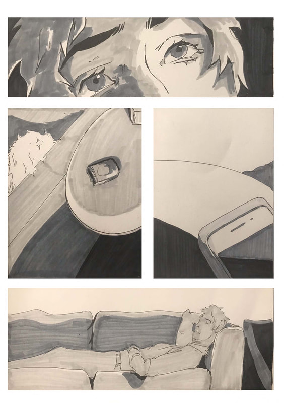
Pages 1 and 2 show a POV of me waking up and looking up at the ceiling, I tried to capture the cartoonish eye framing to help show that its suppose to be somebody waking up even though in retrospect its fairly obvious. Although I'll add that it does make for a more unique framing device rather than just having a standard rectangular shot. The second page shows my face looking up and then show various establishing shots to show that I'm in the living room laying on the couch, generally these panels just help to convey the setting to the viewer. I do feel that some internal dialogue would've probably been best at this stage just to give the viewer something to follow as well as to set the scene a little more, looking back at it now until the conversation starts there's no indication as to why I'm on the couch. Just a sentence or two to convey my mindset would've helped I think.

|

|
Page 3 introduces the other characters of the comic, being my housemates, and shows them hidden behind the wall trying to decide the best way to start a conversation with me without making it too obvious that they're encouraging me to go outside. The dialogue used is also very accurate to how the conversation when down and I tried to include the individual mannerisms that we each have to help the reader distinguish between the two. Page 4 continues the conversation informing the reader that they're essentially witnessing an intervention esc event take place. Although I do like the individual artwork for each panel I do think that I could've framed them in a slightly more dynamic way, for example having some shots either at an angle or perhaps from a unique perspective. Generally however I do like how the artwork turned out mainly because I was keen to try and vary the level of detail between the panels and I feel I captured it effectively here. For example I think that the lower panel is an accurate depiction of me whereas in the shot above it although you can still tell its supposed to be the same human as in the page previously its slightly more abstract to put it nicely.

|

|
Pages 5 and 6 again continue to conversation and I feel this double page spread is the weakest part of the entire comic mainly because I think the panel layouts are the most basic and the artwork isn't framed in a creative way. Every shot is either a single close up on a persons face or a more distant shot of someone across the room with a empty background behind them.

|

|
In contrast to the previous pages being the weakest of the comic I feel that pages 7 and 8 are the strongest. There's minimal dialogue as the conversation has ended and instead shifted to an internal monologue, something which I feel would've been more effective if I had introduced it earlier on in the comic. The main reason I feel that its the part that's illustrated the best is because it includes all the elements that the previous pages don't. Page 7 is just me standing up however all of the shots are taken from a unique perspective and are framed in an effective way compared to the pages previously. This is continued onto page 8 with each panel being creatively framed.
The final pages depict me approaching the front door and the internal conflict I was going through as I got closer, eventually it climaxes with a jump cut to me back face down on the couch after failing to leave the house. Its a slightly more comedic and abrupt end but I wanted it to end on a slightly lighter note, these two pages are also good examples of unique framing techniques in my opinion. Page 9 flips between a close up of my face and the front door, however as I get closer the door becomes more and more distorted as I was trying to imitate a fish eye lens effect which I did by curving the shot around a central point. Page 10 is evidently the most simplistic page of the whole comic as it just consists of a single panel surrounded by a void of white, as mentioned previously I wanted to end it on a comedically abrupt note so I purposefully left the page empty.
The final pages depict me approaching the front door and the internal conflict I was going through as I got closer, eventually it climaxes with a jump cut to me back face down on the couch after failing to leave the house. Its a slightly more comedic and abrupt end but I wanted it to end on a slightly lighter note, these two pages are also good examples of unique framing techniques in my opinion. Page 9 flips between a close up of my face and the front door, however as I get closer the door becomes more and more distorted as I was trying to imitate a fish eye lens effect which I did by curving the shot around a central point. Page 10 is evidently the most simplistic page of the whole comic as it just consists of a single panel surrounded by a void of white, as mentioned previously I wanted to end it on a comedically abrupt note so I purposefully left the page empty.

|

|
In conclusion towards the start of this task I was fairly confident and was curious to see how it would turn out, I haven't really worked in a comic book style before so I had no idea how it would turn out. Im glad I spent time towards the start experimenting with a range of ideas before getting too fixated on a particular idea or style, by gathering a range of options before committing to a final idea it kept my options open which I feel is the main reason I chose to keep the older style margins. If I had just gone with my preferred style of work I would've had a very different looking comic however I don't think it would've been as challenging for me. Whereas even though this style of comic was more basic it forced me to adapt how I preferred to work in rather than just sticking with what I was already confident with. However there are many elements of this comic that I would change if I could go back, the main one being I would spend more time experimenting with various fonts before committing to one. Since I work traditionally most of the time I haven't dedicated much time to typography or digital fonts as a whole, as a result when I was illustrating it I didn't put much thought into where the dialogue would be as I just assumed I would over lay it regardless so it shouldn't affect the overall look too much. In retrospect I should've experimented a little more with various font styles before selecting one. Additionally I think I should've been more creative with the backgrounds of the various panels, often I cropped out certain elements of the backgrounds so that the viewers focus wasn't to drawn away from the main story. However this also includes details such as the details of the walls which I think if I had included it would've made the shots more recognisable and consistent. One final element I would change is that I would try and incorporate a more distinctive start middle and end, although there is a level of progression that takes place in the story its quite blurred I feel, its less structed than I would've wanted it to be which I think is slightly distracting to the reader. If I re did this I would alter the story slightly so that its more apparent when the various story checkpoints are.
Overall however I am pleased with how it turned out, yes there's various corrections which I could make but I knew going into this I wasn't going to make something perfect, Ive made something which I feel accurately depicts a period of my lockdown life and its illustrated in a style which is reflective of my current artistic level.
Overall however I am pleased with how it turned out, yes there's various corrections which I could make but I knew going into this I wasn't going to make something perfect, Ive made something which I feel accurately depicts a period of my lockdown life and its illustrated in a style which is reflective of my current artistic level.